New signs at downtown SF stations part of ongoing BART wayfinding improvements

New sign features larger letters against colored background
BART riders are noticing new and improved signs in downtown San Francisco stations - part of an ongoing program throughout the BART system for wayfinding and signage improvements.
Signs are just one element of the bigger concept of "wayfinding" -- the science, or some would say art, of how people get from place to place and orient themselves in their physical environment. The recent upgrades seen most prominently have been in the busy downtown Montgomery and Powell Street stations. "These are very crowded stations, especially during rush hour, and sometimes you cannot see the signs," explained Tian Feng, District Architect for BART.
There are two types of station name identifiers on the walls: In some places, the station name appears on the wall at eye level -- visible from inside the train if your car happens to stop with a window positioned outside the lettering, but obscured if you are on the platform and a train has pulled in. Other signs -- designed to be visible regardless of whether a train is in the station -- are placed higher, above the level of the train, so you can look across the platform above the opposite side and see which station you're in. Even those, however, might not be seen from all angles, depending on the crowds in the station.
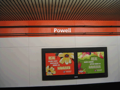
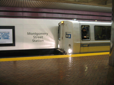
When the previous signs in Montgomery and Powell had to be removed anyway for a deep-cleaning project, it provided an opportunity for new signs with better visibility. The new ones above the train level are a larger font size, with greater contrast against colored-stripe backgrounds, to show up better. The station name lettering on the wall at eye level is also bigger.

Eye-level station name has larger letters
"These are easier to read," said Rob Kennedy, a business traveler from Kansas City, Mo., waiting with his luggage on the platform one recent morning at Montgomery Station. "The old ones were pretty atrocious." Kennedy said he comes to the Bay Area frequently for work and appreciates the improved signage to help him identify which station he needs. "Sometimes the announcements can be pretty hard to hear," he said, mimicking a muffled garble.
UC-Berkeley student Nancy Cen said the new, bigger signs were helpful for her even as a local resident with a basic understanding of the system. "Sometimes, I still have to look out the window to check which station I'm in" to get off at the right stop, she said.
"These are an improvement," said BART rider Kokoe Johnson, of San Francisco. "You have a better chance of seeing them. Since I don't ride every single day, I really need to know which station I'm at."
While it may appear to the casual observer that the station names above trains are simply painted on the wall, they were actually fabricated from metal and placed on the wall for a more reflective surface. The Montgomery wall signs have white letters against a burgundy-stripe background, while the Powell ones have white letters against an orange-stripe background. "These were partly inspired by the history of the stations," Feng noted, explaining that longtime BART riders might remember those shades being used in the early years of the stations' history.
On the list for upcoming sign improvements are Civic Center, along with Embarcadero, which is a more complicated job. Embarcadero is darker and has a lower ceiling, limiting the height at which signs can be placed, and also has a different material for station walls -- marble with raised circular emblems, not the flat stucco surface of some others. "It is more of a challenge, but we are not giving up," said Feng. He said riders can expect to see a different approach at Embarcadero, including backlit signs over the center platform.
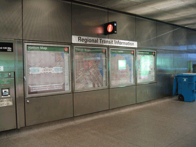
Embarcadero Station already has some other signage improvements at the concourse level, including new touches such as an orange circle with an italicized letter "i" inside, designating "information" -- where additional information is available, such as on transit connections. There is also greater use of pictograms, symbols that point the way to things such as escalators, elevators and buses.

The letter 'i' designates more information, such as on connecting transit
In addition to functionality there is, of course, the subjectivity of aesthetics involved in signage decisions -- there's no shortage of opinions on style, color or materials involved. (At least the font is settled: There's a designated "BART font," Frutiger, so no need to worry that signs will one day appear in comic sans.)
Feng said a major accomplishment has been instituting a unifying set of facilities standards that includes signage -- something that previously did not exist in the BART system, with the resulting chaos and inconsistency that a lack of standards would naturally create.
Feng is trying to fix that now using universal design concepts, one station at a time, and as the work can be fit into other projects. For example, whenever a station has major construction such as the modernization project at Ashby, an effort is made to improve signage at the same time. The new standards incorporate elements such as pictograms or graphics when appropriate, in addition to or in place of text, for greater accessibility.
Step by step, the goal is that all stations eventually will adhere to the standards to have greater consistency and -- ultimately -- better usability for riders.