Local design students invigorate Market Street BART stations with colorful designs
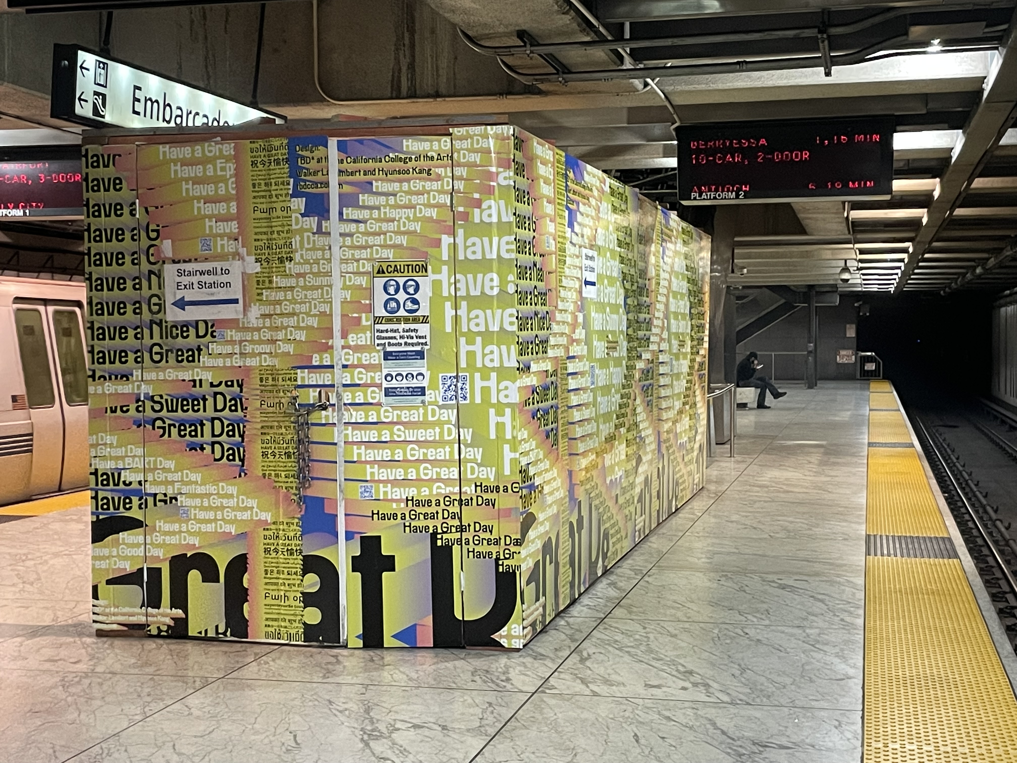
“Have a ___ Day” installed at Embarcadero Station. Photo courtesy of Jennifer Easton.
What comes to mind when you think of San Francisco?
It might be icons, like the Golden Gate Bridge and the Victorians of Alamo Square. It might be the seals at Pier 29 or a bread bowl of chowder from Boudin. It might even be a cup of coffee steaming on a foggy day.
When California College of the Arts students Hyunsoo Kang and Walker Lambert set out to create graphic designs for some of BART’s escalator construction barricades, they wanted the art to feel quintessentially San Francisco. They thought of the fog, the colorful houses, the bridges, but such facile imagery didn’t feel quite right.
Eventually, they settled on three designs that were more metaphorical: a field strewn with flowers, puffy clouds floating overhead; colorful eyes with arms and legs; and a vibrant text-based piece with the words “Have a ___ Day” (Great, Sunny, Happy fill in the blank) plastered across in bold fonts.
Installation of one of the designs began last week on the lower level of Embarcadero Station. The designs bring a slice of joy and color to the station, brightening riders' days and bringing some pizazz to the otherwise drab escalator enclosures.
BART's Market Street station escalators are undergoing a major makeover through the Market Street Escalators Renovation Project, a $96.5 million contract that will install and replace more than 40 escalators at BART’s Market Street stations. Funded by Measure RR, the project is BART’s first major escalator overhaul in two decades.
Kang and Lambert, CCA juniors students of graphic design, connected with BART’s Communications and Art departments through TBD*, CCA’s student-staffed, in-house design studio. Led by CCA instructor and graphic designer Eric Heiman, the course gives students real-life design experience on projects ranging from grocery co-op branding to ACLU ad campaigns.
“When creating TBD*, I was a little less interested in craft and the insular dialogue that design often entails in the classroom,” Heiman said. “I was much more interested in getting students to push their work out into the world and watch how people interact with it or are changed by it.”

Walker Lambert, a designer who helped create the escalator wraps. Photo courtesy of Walker Lambert.

Hyunsoo Kang, a designer who helped create the escalator wraps. Photo courtesy of Hyunsoo Kang.
TBD* students previously worked with BART in 2017 and 2018. One aspect of the collaboration asked students to design a series of etiquette posters for BART stations. The designs ranged from a dirty escalator with the words, “Eww Stop Feeding Me,” to a grumpy green seat declaring, “Let the Pregnant Lady Sit Down.” The student designers even made it onto the local news.
Impressed by the previous students’ work, BART once again reached out to Heiman, this time with the goal of creating attractive, delightful designs for the escalator barricades. Heiman assigned Kang and Lambert to the project, hoping their varied skillsets would complement one another. Collaboration, Heiman said, is key to creating impactful designs.
“There tends to be this implication that design is this lone wolf sort of act,” Heiman said. “But for me, it’s very collaborative. Part of it is getting students to let go of this preciousness that everything is mine and I do it all myself. Collaboration yields much more interesting work sometimes.”
Kang and Lambert come from different backgrounds – Lambert got into design through skateboarding, while Kang admitted, with a laugh, that she’s “more into golf.”
“I’m really interested in research and the story,” Kang said, “While Walker was able to visually show what we wanted the story to say.”
Lambert said the experience changed his perspective on design.
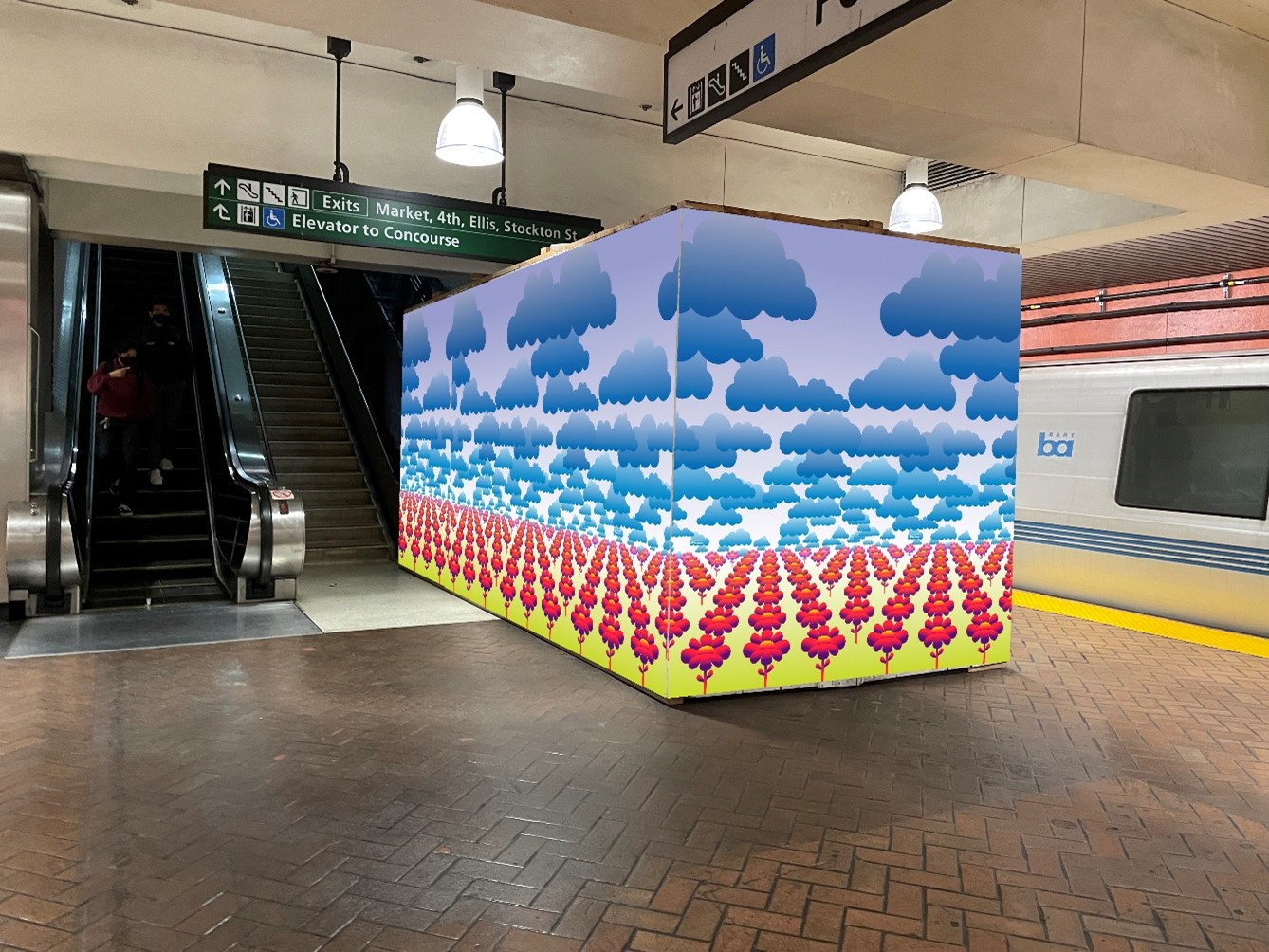 A rendering of another design to be installed at San Francisco stations.
“It’s definitely a team thing,” he said succinctly.
But the teamwork doesn’t end with the student interactions. Heiman said it’s important that students learn not just how to work for the client, but with the client. Kang and Lambert had regular meetings with Jennifer Easton, BART’s Art Programs Manager, and Alicia Trost, BART’s Director of Communications, to determine how the designs would best fit into BART’s stations.
“Bringing student artists and designers into collaboration with BART is an important part of the BART art program,” Easton said. “It gives them an opportunity to see the ins and outs of working with a client/collaborator like BART, and it gives BART an opportunity to bring the perspectives of our next generation into the transit experience. Some of these collaborations have really kickstarted some new thinking for BART.”
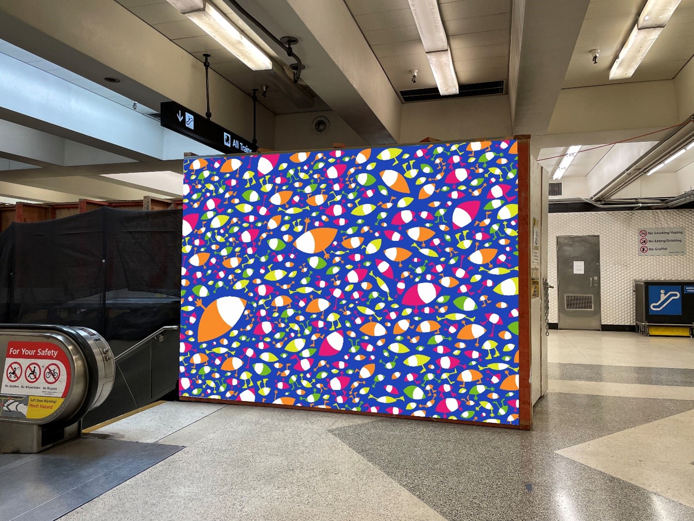 A rendering of another design to be installed at San Francisco stations.
Lambert said the design process happened slowly, with he and Kang creating many iterations.
“It was a process of trying things over and over until we found what clicked,” Lambert said. “…It was almost a process of elimination of ideas; it was figuring out what not to do before what to do.”
To research, the students studied BART guidelines and statistics and learned about the transit system’s history. They even read Yelp reviews of various stations to understand how they could improve the “vibes.”
Incorporated into each design are “little gifts,” as the students call them. If you scan the QR codes integrated into the designs with your phone, an augmented reality surprise appears on the screen.
BART and the CCA team hope that the designs will surprise and delight riders and, importantly, offer them a feeling of orientation after more than two years of disorientation.
“It’s about purpose, it’s about context, it’s about having an impact,” Heiman said. “And it’s about us, not I.”
