New project to unify Bay Area transit maps and signs is underway

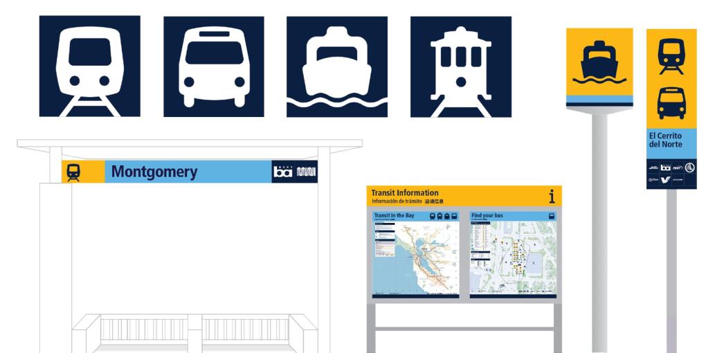
Bay Area transit’s ongoing transformation into a more connected, more efficient and more customer-focused mobility network today took another big step forward as transit agency and Metropolitan Transportation Commission (MTC) staff have unveiled design prototypes for a common set of signs to be used by all agencies at all locations — from individual bus stops to major hubs where multiple systems connect. These prototypes will be installed later this year at the El Cerrito del Norte BART station, the Santa Rosa Transit Mall and the nearby Santa Rosa SMART station.
To establish and reinforce a common identity for all Bay Area transit services, the new signage employs a three-color palette of golden yellow, sky blue and dark blue; as well as simple icons to identify service by trains, buses or ferries. These icons are larger and more visually prominent than the logos of the individual agencies providing the services at each location. The modal icons and the three-color palette will be extended to a new mobile-friendly website to which passengers can connect via QR codes at each bus stop, train station or ferry terminal, providing real-time information along with accessibility features such as audio descriptions and language translation.
More than 90 percent of Bay Area residents polled by MTC in 2021 identified uniform and easy-to-use transit maps and signage as an important priority for improving the region’s transit network. MTC’s Operations Committee in 2022 approved a contract with Applied Wayfinding Inc. to develop a single mapping and wayfinding system for use by all Bay Area transit agencies. Applied has completed similar projects in London; Toronto; Seattle; Cleveland; Vancouver, B.C.; and elsewhere. The design concepts incorporate comments and recommendations from more than 1,000 Bay Area residents — including transit riders and nonriders, people with limited English proficiency and people with disabilities — who participated in MTC-sponsored surveys, workshops and focus groups. New transit signage will include tactile and Braille elements.
The golden yellow in the three-color palette developed by transit agencies, MTC and the design contractor was chosen to represent the Bay Area’s sunshine and golden hills, with the light blue representing clear skies and the dark blue representing San Francisco Bay, lakes, rivers and other bodies of water. MTC and its partners will invite Bay Area residents and visitors alike to share their thoughts about the newly designed transit signs and digital wayfinding tools once the prototypes — which have not yet been fabricated — are installed at the Santa Rosa and El Cerrito locations.
Design prototypes for a consistent set of transit maps will be unveiled later this year.
